OS Styling Guide
Retail Circle Design System — Extracted from published pages only. Darkbit X template defaults removed. Investor Portal excluded.
PART 1 — COLORS / PRIMARY
#694ef7 — Primary Purple
#cdaafb — Light Lavender
#5038d3 — Deep Purple
#636aff — Blue-Violet
#785ef7 — Stripe Purple
#7a11ff — Vivid Purple
#9777f4 — Soft Purple
#cba4f9 — Pale Purple
#e2b8fa — Lightest Purple
COLORS / BACKGROUND SWATCHES
Deep Dark #191923
Card #333336
Card Surface #302f35
Panel #2d2d3e
COLORS / NEUTRAL PALETTE
#1c1c1f — Neutral/800
#333336 — Neutral/700
#8f8fa5 — Neutral/500
#c3c3d0 — Neutral/400
#f6f6fa — Neutral/200
#484853 — Neutral/600
#e4e4ed — Neutral/300
TYPOGRAPHY / HEADINGS & BODY
Display 1 — 72px
Display 2 — 54px
Heading H2 — 38px
Heading H3 — 24px
Paragraph Large — The quick brown fox jumps over the lazy dog.
Text 300 — Body text sample. The quick brown fox jumps over the lazy dog.
CORE COMPONENTS / BUTTONS & CTAs
BRAND & IDENTITY / LOgos

COLORS / STATUS
#05c168 — Success
#ff9e2c — Warning
#ff5a65 — Error
#1d88fe — Info
LAYOUT & SPACING
CORE COMPONENTS / CARDS, FORMS, NAVIGATION
Cards: Card (#333336) • Card 2 (#302f35) • Card_landing (55% width, BG image + gradient). Forms: Inputs dark #333336, white text, rounded. Submit: BTN Primary 2 + BG. Error: #ff5a65 border.
Navigation: Header (91db2b8c) • Footer (e79c7cff) • Newsletter (0dd660f7) • Brands (12c4e3f6) • CTA (09ed9029). Accordion: Item Wrapper (flex, 40px padding, 1px #484853 border) → Header + Body. Tabs: Tabs Wrapper + Tabs Left.
Accordion: Accordion Item Wrapper (flex, space-between, 40px padding, 1px border bottom #333336). Header + Body pattern. Icon rotates on open. Tabs: Tabs Wrapper + Tabs Left (left-aligned). Tabs Menu + Tabs Vertical Menu. Tab Link (active: underline + purple).
FAQ Section: Section + PD 120px. Accordion Item Wrapper → Header + Body pattern. Plus icon rotates 45° on toggle. Text 300 body. Border bottom 1px #333336 separator between items.
Card — #333336
Card 2 — #302f35
Card — #333336
Card 2 — #302f35
Email address...
How does the authentication work?
+
What payment methods do you accept?
+
Can I upgrade my plan later?
+
PART 2 — GRADIENTS & CSS DEFINITIONS
CTA Primary — linear-gradient(163deg, #cdaafb, #694ef7)
CTA Hover — linear-gradient(319deg, black → #9677f9)
Rainbow — linear-gradient(to right, #785ef7 → #e2b8fa)
Hero Glow — linear-gradient(120deg, #e2b8fa → #636aff)
CTA Primary
CTA Hover
Rainbow Horizontal
Hero Glow
PAGE SECTIONS / HERO, FEATURES, FAQ, CTA, PRICING
Hero: Section + Hero + Top 78px. Grid 2 Columns (text left, mockup right). Gradient BG glow. 3D shapes absolute. Display 1 + Paragraph Large + BTN Primary 2.
Features: Section (200px padding). Grid 1.5fr 1fr or 2-col. Card/Card 2 with Feature combos. FAQ: Section + PD 120px. Accordion pattern with 1px #484853 borders.
CTA: Component 09ed9029. CTA V2 (186px padding, BG image, 3D shapes). Pricing: Tab navigation. Cards: Club £750/mo, Black £1,950/mo. Comparison table.
MOTION & ACCESSIBILITY
All interactive elements: transform 300ms ease, background-color 300ms ease, border-color 300ms ease, color 300ms ease. Scroll animations via Webflow IX2. Focus states: recommend adding focus-visible outlines. Color contrast: white on dark >7:1 ratio.
CLASS NAMING SYSTEM & AI GENERATION RULES
ALWAYS: Header + Footer on every page. Container Default (1316px). Dark theme. Neuehaasdisplaymediu for headings. BTN Primary 2 + BTN Primary BG for CTAs. Pill buttons (1000000px radius). Gradient: linear-gradient(163deg, #cdaafb, #694ef7).
NEVER: Use unverified Darkbit template classes. New fonts. Light backgrounds without request. Hardcode colors. Skip gradient BG child on buttons. Non-pill radius on buttons. More than 3 nesting levels per builder call.
Classes: Section, Container Default/Large, Inner Container + size combos. BTN Primary/Secondary. Card, Card 2, Card_landing. Accordion Item Wrapper. Tabs Wrapper. Position Absolute, Z Index 1/2. MG Bottom 0-80px. PD 120px.
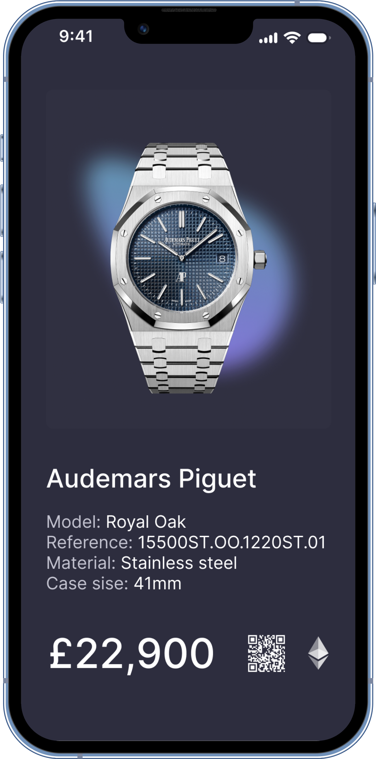
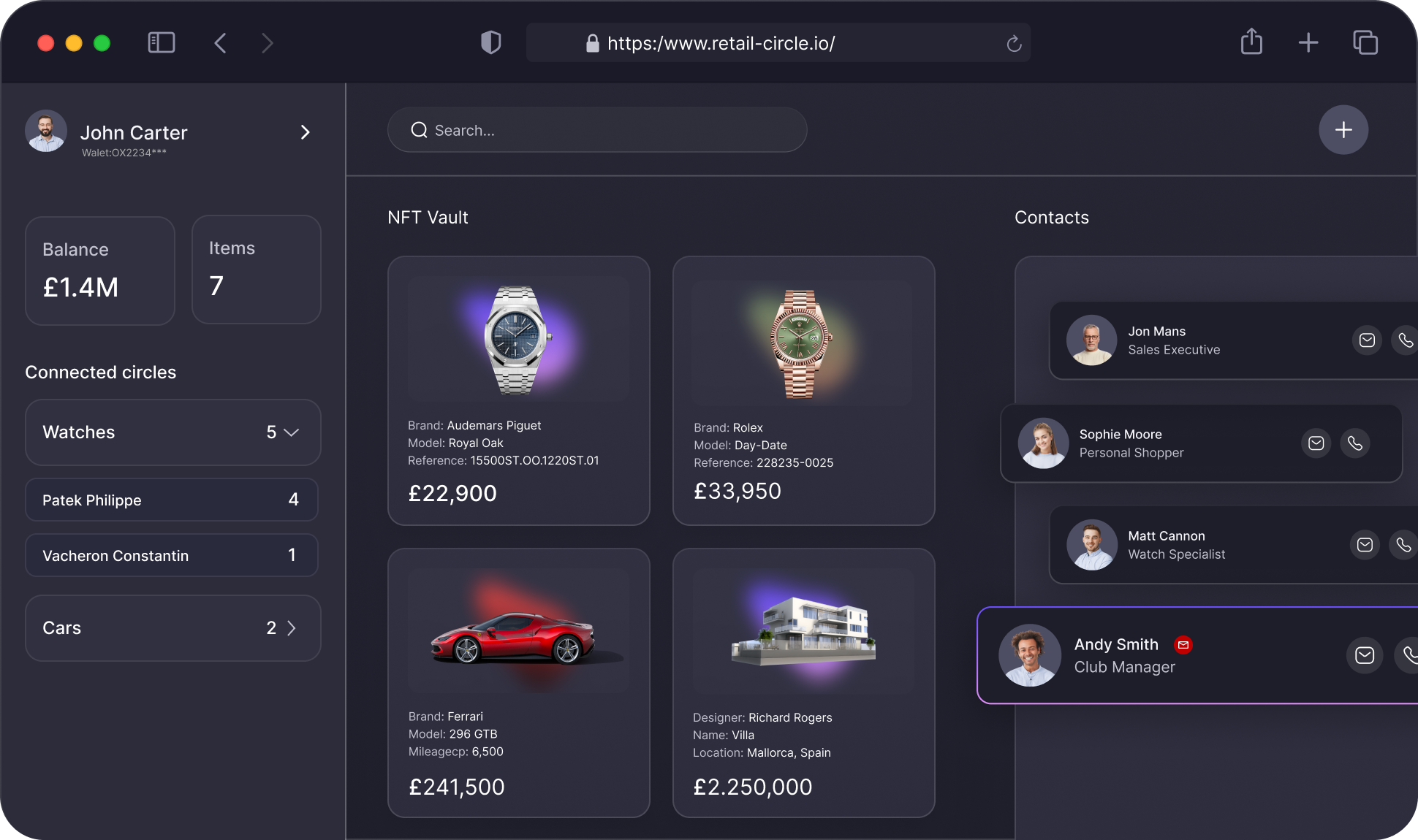
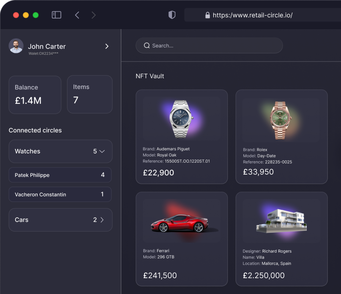
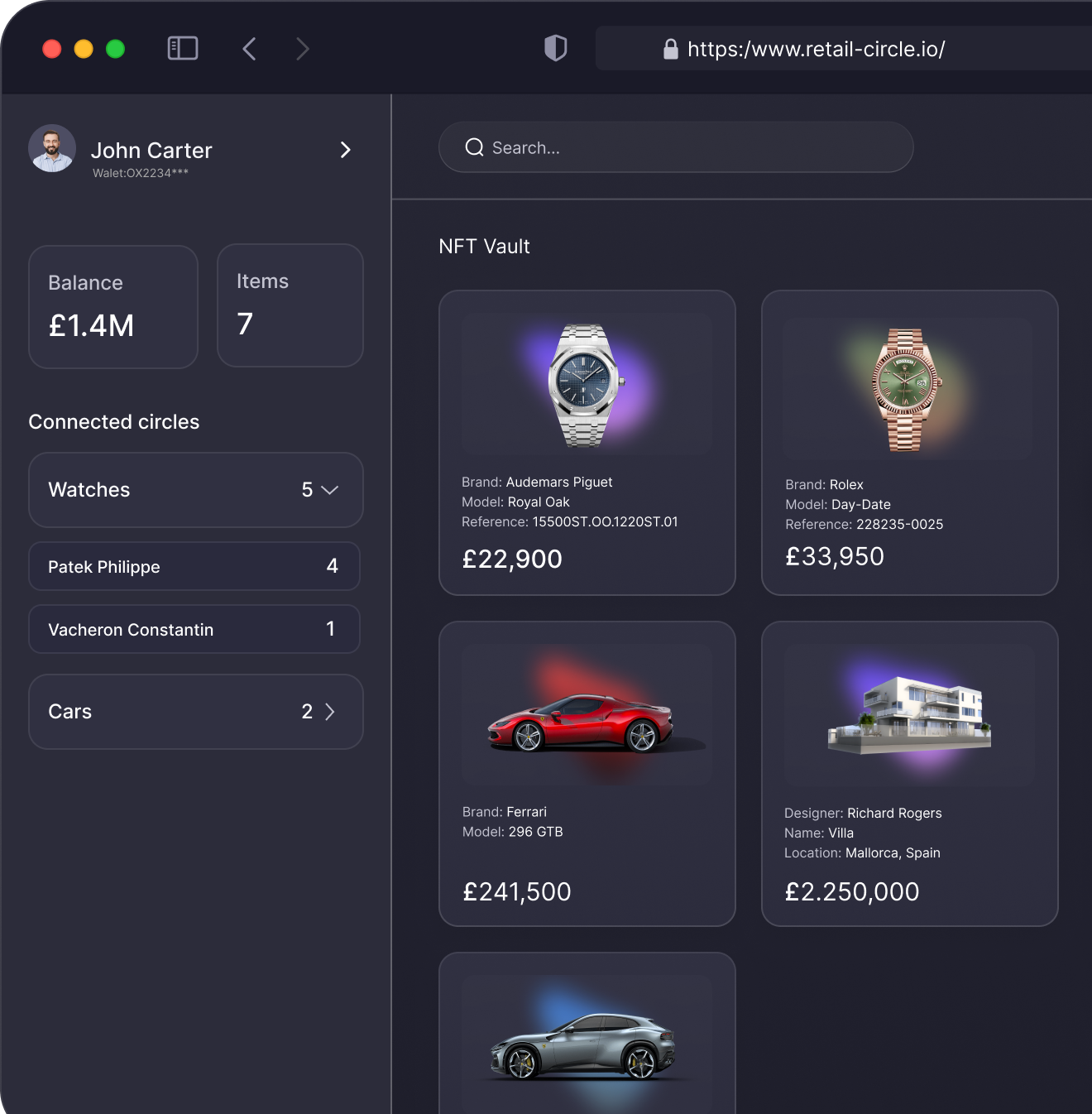
MEDIA / PRODUCT MOCKUPS

MEDIA / 3D SHAPES & GRADIENT ASSETS

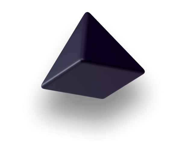
shape-3d-5 (Cube)

shape-3d-4

shape-3d-3

shape-3d-2
shape-3d-1

shape-3d-6

shape-3d-7
Icon (SVG)