PART 1 — COLORS / PRIMARY
Secondary/Color 1 — #694ef7 — Primary brand purple
Secondary/Color 2 — #cdaafb — Light lavender
Secondary/Color 3 — #5038d3 — Deep purple
Secondary/Color 4 — #636aff — Blue-violet
Secondary/Color 5 — #785ef7 — Stripe button
Color 6 — #7a11ff — Vivid purple
Color 7 — #9777f4 — Soft purple
Color 8 — #cba4f9 — Pale purple
Color 9 — #e2b8fa — Lightest purple
Color 6 — #7a11ff — Vivid purple
Color 7 — #9777f4 — Soft purple
Color 8 — #cba4f9 — Pale purple
Color 9 — #e2b8fa — Lightest
COLORS / NEUTRAL PALETTE
Neutral/800 — #1c1c1f
Neutral/700 — #333336
Neutral/500 — #8f8fa5
Neutral/400 — #c3c3d0
Neutral/200 — #f6f6fa
Neutral/600 — #484853
Neutral/300 — #e4e4ed
TYPOGRAPHY / HEADINGS & BODY
Display 1 — 72px
Display 2 — 54px
Heading H2 — 38px
Heading H3 — 24px
Paragraph Large — The quick brown fox jumps over the lazy dog. Empowering modern luxury buyers with AI.
Text 300 — Body text sample. The quick brown fox jumps over the lazy dog.
Display 3 — 32px
Heading H4 — 22px
Text 100 — Body medium weight sample text for labels and UI elements.
04 — Buttons & CTAs
05 — Gradients

gradient-01 (Hero BG)

gradient-04 (Accent)


Gradient 8 (Most used BG)

Gradient 11 (PNG effect)
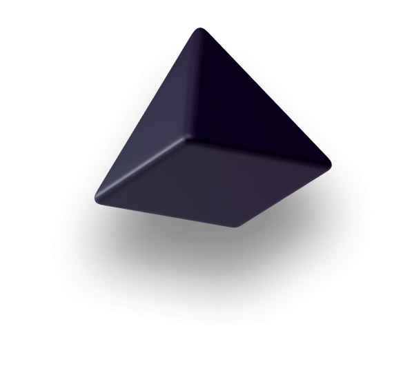
MEDIA / 3D DECORATIVE SHAPES

shape-3d-5 (Cube)

shape-3d-4

shape-3d-7

shape-3d-3


BRAND & IDENTITY / LOGO SYSTEM

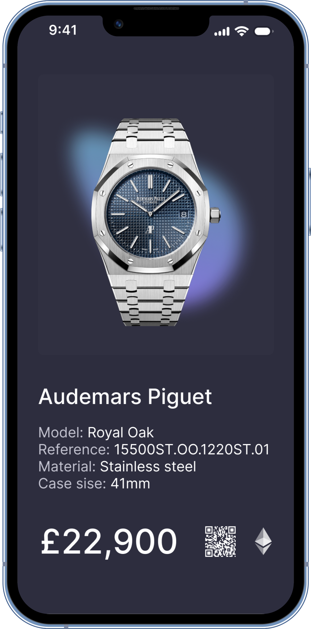
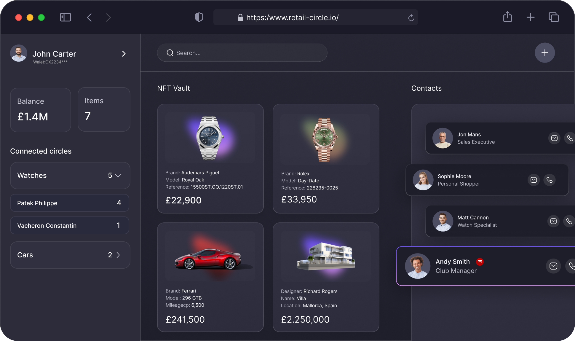
MEDIA / PRODUCT MOCKUPS & HERO IMAGES


CORE COMPONENTS / NAVIGATION & REUSABLE
Header (91db2b8c) • Footer (e79c7cff) • Newsletter (0dd660f7) • Brands (12c4e3f6) • CTA (09ed9029) • Digital property rights (ad039d08) • Verif (f401378f) — Always use Header and Footer components on every page.
LAYOUT & SPACING / CONTAINERS, GRIDS, BREAKPOINTS
Spacing Scale — xs: 8px • sm: 12px • md: 16px • lg: 24px • xl: 32px • 2xl: 40px • 3xl: 48px • 4xl: 56px • 5xl: 80px • section-sm: 120px • section-lg: 200px
Containers — Default: 1316px max-width, 24px padding. Large: 1517px. Inner containers: 472px, 500px, 533px, 600px, 700px, 756px, 867px, 908px. Mobile variants: -MBL suffix. Tablet variants: -Tablet suffix.
Grids — Hero: Grid 2 Columns + Image Right Hero (1fr 1fr). Features: Features Section Grid (1.5fr 1fr, row-gap 32px). Standard: Grid 2 Columns. Breakpoints: Desktop (main), Tablet ≤ 991px, Mobile Landscape ≤ 767px, Mobile Portrait ≤ 478px.
PAGE SECTIONS / HERO, FEATURES, FAQ, CTA, PRICING
Hero Section — Section + Hero + Top 78px combos. Grid 2 Columns with text left, mockup right. Image Right Hero Gradient BG glow. 3D shapes with Position Absolute + Shape 3D class. Display 1 heading, Paragraph Large body, BTN Primary 2 CTA.
Feature Section — Section base (200px padding). Features Section Grid (1.5fr 1fr) or Grid 2 Columns. Card / Card 2 with Feature combo classes. Display 2/3 headings with icon + description cards.
FAQ Section — Section + PD 120px. Accordion Item Wrapper → Header + Body pattern. Accordion BTN Line (24px × 2px, absolute). 1px solid #484853 borders. Tabs Wrapper + Tabs Left for categories.
CTA Section — Component 09ed9029. CTA V2 (186px padding, BG image, 3D shapes). CTA V3 variant. Heading + description + BTN Primary 2 CTA button.
Pricing Section — Tab navigation (Expert/Merchant/Enterprise). Pricing cards: Club £750/mo, Black £1,950/mo. Comparison table with checkmarks. Monthly/Yearly toggle.
Class Naming — Layout: Section, Container Default, Inner Container, Page Wrapper. Buttons: BTN Primary, BTN Secondary. Cards: Card, Card 2, Card_landing. FAQ: Accordion Item Wrapper, Tabs Wrapper. Position: Position Absolute, Z Index 1/2. Spacing: MG Bottom 0-80px, PD 120px.
MOTION & ACCESSIBILITY
All interactive elements: transform 300ms ease, background-color 300ms ease, border-color 300ms ease, color 300ms ease. Scroll animations handled by Webflow IX2 interactions system. No custom CSS animations defined.
CLASS NAMING SYSTEM & AI GENERATION RULES
ALWAYS: Use Header + Footer components on every page. Use Container Default (1316px). Dark theme background. Neuehaasdisplaymediu for headings. BTN Primary 2 + BTN Primary BG for CTAs. Pill buttons (border-radius: 1000000px). Primary gradient: linear-gradient(163deg, #cdaafb, #694ef7).
NEVER: Use Darkbit template classes not on published pages. Introduce new fonts. Use light backgrounds without explicit request. Hardcode colors (use swatches). Skip gradient BG child on primary buttons. Use non-pill border-radius on buttons.
BRAND & IDENTITY / VOICE & TAGLINE
Brand Voice — Premium, technical, confident. Luxury meets technology. Speaks to watch dealers, collectors, and luxury merchants. Authoritative yet approachable. Think: your AI-powered luxury trading partner.
Tagline — Empowering modern luxury buyers with AI and human experts.
BRAND VOICE & TAGLINE
Voice: Premium, technical, confident. Luxury meets technology. Tagline: Empowering modern luxury buyers with AI and human experts.
COLORS / STATUS & SYSTEM
Success — #05c168
COLORS / BACKGROUND
Deep Dark — #191923
Card Surface — #302f35
Card Default — #333336
CORE COMPONENTS / CARDS
CORE COMPONENTS / FORMS
Inputs: Dark bg #333336, white text, rounded corners. Submit: BTN Primary 2 + BTN Primary BG. Error state: #ff5a65 border. Used on Registration, Waitlist, Contact pages.
COLORS / EXTENDED PURPLE (6-9)
GRADIENTS / CSS DEFINITIONS
MEDIA / ADDITIONAL MOCKUPS

TYPOGRAPHY / EXTENDED (H4, H5, LABELS)
Heading H4 — 22px
Heading H5 — 18px
ADVANCED UI / ACCORDION & TABS PATTERN
Accordion: Accordion Item Wrapper (flex, space-between, 40px padding, 1px border #484853) → Header (flex, align-center) + Body (overflow hidden). Title: Neuehaasdisplaymediu, mb 0. Toggle: BTN Line (24px × 2px, absolute, white bg). Tabs: Tabs Wrapper + Tabs Left + Tabs Vertical. Tab buttons: BTN Secondary 6 style.
MEDIA / ICONS


Voice: Premium, technical, confident. Luxury meets technology. Tagline: Empowering modern luxury buyers with AI and human experts.
COLORS / STATUS & SYSTEM
Success — #05c168
Success — #05c168
Warning — #ff9e2c
Error — #ff5a65
Info — #1d88fe
COLORS / BACKGROUNDS
Page BG — #191923
Card Surface — #302f35
Card Default — #333336
CORE COMPONENTS / CARDS
Card (bg: #333336, overflow hidden) • Card 2 (bg: #302f35, overflow hidden) • Card_landing (55% width, BG image + gradient overlay) • Card Pricing Top/Bottom (pricing tiers) • Card Tool Content (64px padding)
CORE COMPONENTS / FORMS
Text Input / Email / Textarea — Dark background (#333336), white text, rounded corners, 1px border #484853. Submit Button — Uses BTN Primary 2 + BTN Primary BG pattern. Error State — Red #ff5a65 border highlight. Select Dropdown — Dark background matching input style.
CORE COMPONENTS / ACCORDION & TABS
Accordion: Accordion Item Wrapper (flex, space-between, 40px padding, 1px border #484853, cursor pointer, 300ms ease) → Accordion Header (flex, align-center) + Acordion Body (overflow hidden). Title: Accordion Title (Neuehaasdisplaymediu, margin 0). Toggle: Accordion BTN Line (24px × 2px, absolute, white bg, rounded 20px). Icon: Accordion Icon Wrapper (24px flex center).
Tabs: Tabs Wrapper + Tabs Left (left-aligned variant). Tabs Menu + Tabs Vertical (vertical tab layout, Width 296px). Tab Link Sidebar (BTN Secondary 6 style, pill shape). Tabs Content (Width 864px, margin-left auto). Used on FAQ and Pricing pages for category navigation.
Voice: Premium, technical, confident. Luxury meets technology. Tagline: Empowering modern luxury buyers with AI and human experts.
Voice: Premium, technical, confident. Luxury meets technology. Tagline: Empowering modern luxury buyers with AI and human experts.
COLORS / STATUS & SYSTEM
Success — #05c168
Warning — #ff9e2c
COLORS / BACKGROUNDS
Deep Dark BG — #191923
Neutral/800 BG — #1c1c1f
Card BG — #333336
Panel BG — #2d2d3e
Page BG — #191923
Panel BG — #2d2d3e
CORE COMPONENTS / CARDS
CORE COMPONENTS / FORMS
Inputs: Dark background #333336, white text, rounded corners. Submit: BTN Primary 2 + BTN Primary BG gradient. Error state: Red #ff5a65 border. Used on Registration, Waitlist, and Contact pages.
COLORS / TEXT COLORS
Headings on dark: white (#ffffff). Body text default: #c3c3d0 (Neutral/400, Page Wrapper inherited). Body light: #e4e4ed (Neutral/300). Links: hsla(240, 12.15%, 79.02%, 1.00). Tab text: #c3c3d0.
Voice: Premium, technical, confident. Luxury meets technology. Tagline: Empowering modern luxury buyers with AI and human experts.
Voice: Premium, technical, confident. Luxury meets technology. Tagline: Empowering modern luxury buyers with AI and human experts.